When you’re planning an ecommerce app, other retailers’ apps are the obvious place to look for ideas. The useful question isn’t how they look. It’s what their apps make easier for customers.
The strongest examples give people a reason to install, then make one or two important jobs easier. That might mean trying a product before buying it, managing a repeat order, checking stock at a nearby store, or getting ready for a limited release.
This guide looks at ten ecommerce mobile apps with different business models, catalogs, and customer journeys. It doesn’t rank their visual design or suggest you copy every feature. It identifies the specific job each app does well and the lesson you can apply to your own.
If your store runs on Shopify, our Shopify mobile app examples cover brands closer to your size and stack.
What Makes an Ecommerce App Worth Studying?
An ecommerce app is worth studying when it improves the shopping experience or supports the business behind it, not just when it has a polished home screen.
The apps below stand out in at least one of four ways:
- They remove friction from a high-value customer journey.
- They use phone capabilities that a mobile website can’t match as easily.
- They connect online shopping with stores, services, or membership.
- They give repeat customers a clear reason to keep the app installed.
An app doesn’t need to do all four. It needs to do the jobs that matter for its customers unusually well.
| App | The job it does best | Feature worth studying |
|---|---|---|
| Nike | Deepens membership | Member rewards and exclusives |
| Sephora | Keeps loyalty in the buying journey | Beauty Insider offers and redemption |
| IKEA | Supports planning and store visits | Room scanning and scan-as-you-shop |
| Warby Parker | Reduces fit uncertainty | Virtual try-on and PD measurement |
| Chewy | Manages repeat pet care | Autoship and refill reminders |
| Walmart | Connects online and in-store shopping | Curbside check-in and Walmart Pay |
| REI Co-op | Makes store visits more useful | In-store barcode scanning |
| GOAT | Builds marketplace trust | Price-drop alerts and buyer protection |
| Sam’s Club | Saves time in the club | Scan & Go |
| adidas CONFIRMED | Prepares fans for releases | Saved sizes, draws, and release alerts |
1. Nike Builds the App Around Membership
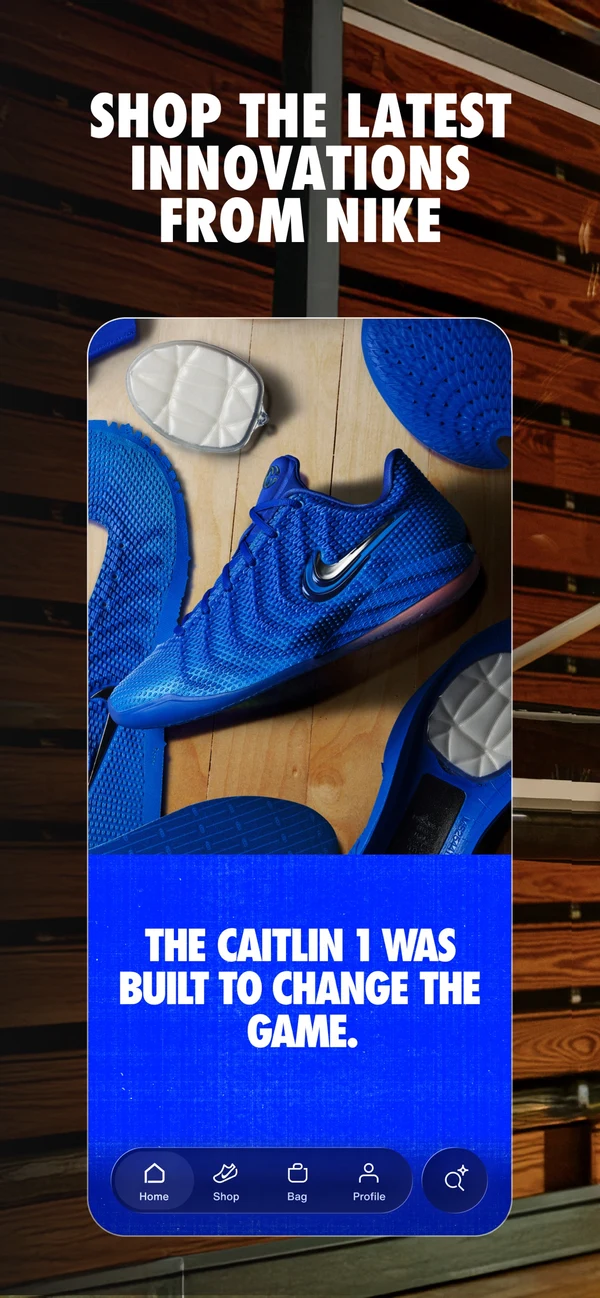
The Nike App is a shopping channel, but shopping isn’t its only organizing idea. Membership is.
Nike uses the app to bring member rewards, exclusive products, personalized style advice, order history, free shipping, and receiptless returns into one persistent account. The customer isn’t asked to download a generic catalog. They’re asked to join a closer relationship with the brand.
That distinction shapes the whole experience. Personalized recommendations and saved account details become central rather than optional. Exclusive products give customers a reason to open the app before they have a specific purchase in mind. Member benefits make the app useful after checkout as well as before it.
Make Membership the Reason to Return
Nike gives its app a clear audience: people who want more from the brand than an occasional transaction.
If your strongest customers already use loyalty, attend launches, collect products, or engage with your content, build the app around that relationship. Don’t bury the membership value behind a standard product grid.
2. Sephora Keeps Loyalty Inside the Shopping Journey
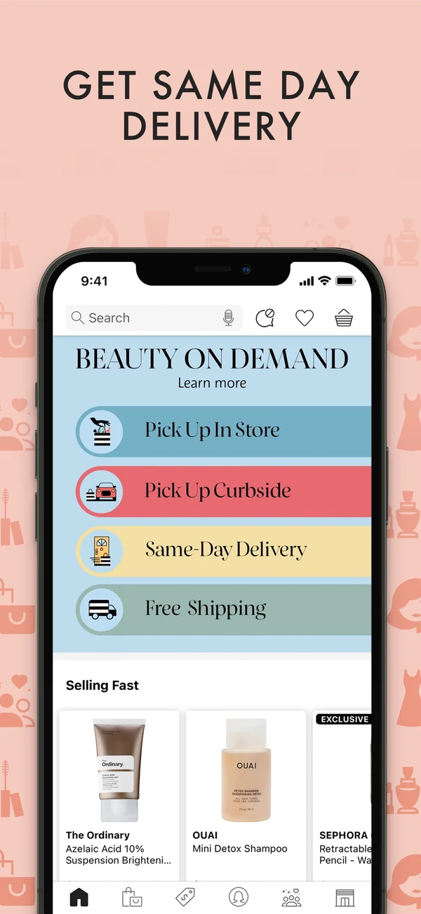
Beauty shoppers often move back and forth between discovery, education, rewards, samples, offers, and replenishment. The Sephora app keeps those activities together.
Customers can shop a large catalog, discover new routines and trends, access Insider-only offers, and redeem Beauty Insider points for Beauty Insider Cash or samples. Loyalty isn’t a separate page the customer checks once in a while. It’s part of how products, promotions, and purchase decisions are presented.
That matters because a loyalty program creates little value if customers can’t see what they’ve earned or use it when they’re ready to buy. The app gives Sephora a persistent place to connect those benefits to the next order.
Show Rewards Where Customers Make Buying Decisions
Rewards are most useful when they’re visible at the moment of choice.
If your app includes loyalty, show the customer’s balance, available benefits, progress, and redemption options where they affect the purchase. Making users hunt through an account menu weakens the value you’ve already paid to create.
3. IKEA Connects Planning, Shopping, and the Store
The IKEA app supports a more complicated journey than a typical product purchase.
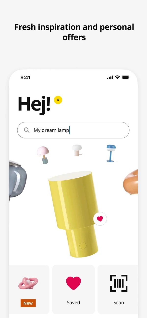
A customer might collect ideas at home, plan a kitchen, check whether an item is in stock, find their way around a large store, scan products as they shop, then track the order. IKEA brings many of those steps into the same app.
Its planning tools let customers scan a room and visualize products in their space. In-store navigation and scan-as-you-shop checkout help during a physical visit. Saved lists, stock alerts, digital receipts, and order tracking carry the relationship across multiple sessions.
IKEA notes that some features aren’t available in every country, but the broader design lesson holds: the app follows the real customer journey instead of treating checkout as the only valuable moment.
Support the Journey Before and After Checkout
IKEA looks beyond the transaction.
Map what happens before and after the order in your category. If customers need to plan, compare, measure, replenish, assemble, register, or manage a product, your app may be able to own more of that journey.
4. Warby Parker Uses the Phone to Reduce Purchase Uncertainty
Buying glasses online creates an obvious problem: customers want to know how frames will look and fit.
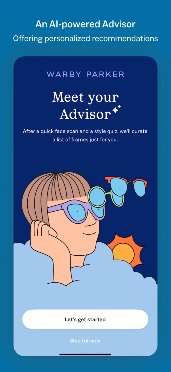
The Warby Parker app uses the phone’s camera to measure facial features and address that uncertainty. Customers can virtually try on frames, find their frame width, get AI-powered recommendations, manage prescriptions, and measure their pupillary distance.
These aren’t decorative native features. They answer questions that might otherwise stop a customer from ordering.
Warby Parker also explains how facial measurements are used and states that face-scan data isn’t stored or shared with third parties. That privacy communication is part of the experience. A clever camera tool is only useful if customers trust it enough to grant access.
Use the Camera to Resolve a Buying Question
Warby Parker ties native capability to a real buying barrier.
Don’t add augmented reality, camera access, or another mobile technology because it looks impressive in a sales demo. Use it when it helps customers make a better decision, save time, or complete a task that’s awkward on the web.
5. Chewy Makes Repeat Purchasing Easier to Manage
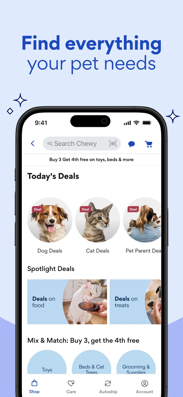
Pet food, medication, and everyday supplies create regular repeat orders. The Chewy app is designed around that ongoing responsibility.
Customers can set up Autoship deliveries, shop pet supplies, use the pharmacy, get medicine refill reminders, book vet consults, and reach pet experts around the clock. The app isn’t only a faster way to place the first order. It becomes a control panel for what each pet needs over time.
This is a strong fit between category and app behavior. Reordering works best when the customer can see the current schedule, make a change quickly, and trust that nothing important will be missed.
Make Repeat Orders Easy to Manage
Chewy turns a recurring purchase into an ongoing service relationship.
If your products are replenished, subscribed to, or managed over time, prioritize the account experience. Let customers change dates, quantities, products, addresses, and payment details without contacting support or leaving the app.
6. Walmart Unifies Several Shopping Modes
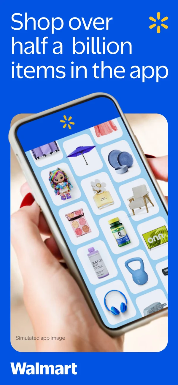
For Walmart, mobile shopping can mean delivery, shipping, pickup, or a trip through the store. The Walmart app supports all of them.
Customers can browse and order, check in when they arrive for pickup, scan items in store to check prices and reviews, find products with store maps, pay with Walmart Pay, access e-receipts, and refill prescriptions. The app acts as connective tissue between ecommerce and physical retail.
That breadth could easily become confusing. The design challenge is to make the customer’s current mode clear. Someone checking in for pickup needs a different shortcut from someone building a grocery order at home.
Adapt the App to the Customer’s Current Task
Walmart’s app has to recognize what the customer is doing right now.
If you have stores, pickup points, service locations, or several fulfillment options, don’t make every customer begin from the same generic home screen. Surface the next likely action based on the order, location, or task in progress.
7. REI Helps Customers Use the Store More Effectively
The REI Co-op app doesn’t treat stores as competition for the app.
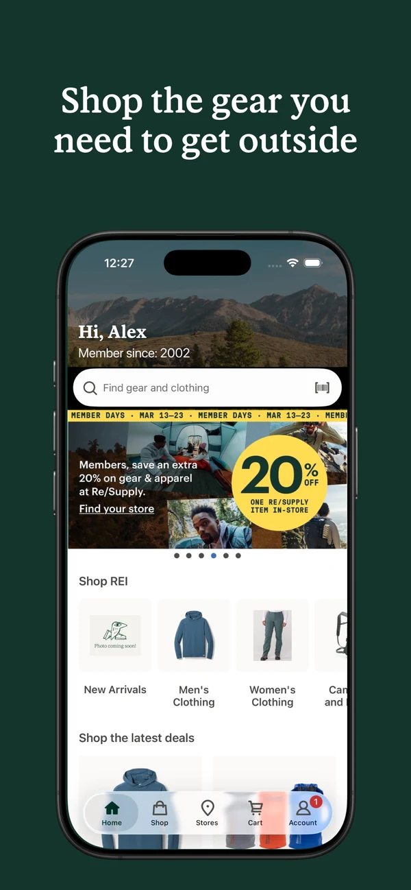
Customers can order for free pickup at a nearby store and scan barcodes in store to see more product details and reviews. That’s especially useful in a technical category, where a shopper may want to handle an item in person but still needs specifications, comparisons, or customer feedback.
The app extends what a store associate and a shelf label can provide. It also lets the customer carry wish lists and research from home into the store without starting again.
Help Customers Shop Across Channels
REI uses the app to make another channel better.
An omnichannel app doesn’t need to push every customer toward delivery. It can help them check local availability, save a list, scan an item, access membership, or prepare for pickup. The right measure is whether the full journey improves, not whether every order stays inside the app.
8. GOAT Designs Around Marketplace Trust and Timing
A resale marketplace has to solve problems that a standard retailer doesn’t. Buyers need confidence in authenticity and price. Collectors need to follow releases and act when an item becomes available.
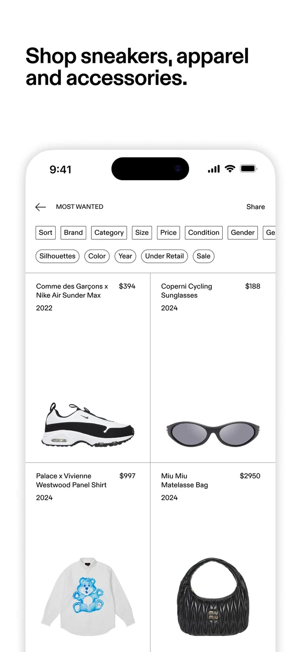
The GOAT app brings those needs together. Customers can shop new and pre-owned products, place offers, save most-wanted styles, get price-drop and restock alerts, track upcoming releases, and use augmented reality to see sneakers on foot.
Buyer protection and authenticity assurance sit in the app’s core pitch, not in small-print policies hidden after checkout.
Design for Your Business Model’s Specific Decisions
GOAT’s app reflects the mechanics of its business model.
If you run a marketplace, rental service, subscription, auction, made-to-order store, or another non-standard model, don’t force it into a conventional retail template. Your interface needs to make your unique states, risks, and customer decisions clear.
9. Sam’s Club Removes the Checkout Line
The Sam’s Club app has a simple, valuable in-club feature: Scan & Go.
Members can scan items as they shop and skip the checkout line. The same app also handles members-only pricing, curbside pickup, delivery, shipping, and local fuel prices.
Scan & Go is a useful example because its benefit is easy to explain. The customer downloads the app to save real time during a routine they already complete.

Remove a Repeated Source of Friction
Scan & Go removes a visible piece of friction.
Look for repeated waits, handoffs, or manual steps in your customer journey. A focused utility that saves time on every visit can create more lasting value than a long list of minor shopping features.
10. adidas CONFIRMED Focuses on One High-Intent Moment
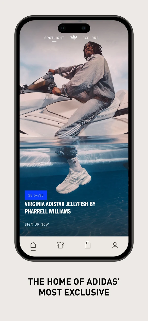
The adidas CONFIRMED app isn’t trying to be the only place customers shop the entire adidas catalog. It’s built around rare releases, collaborations, and the culture surrounding them.
Customers can save their sizes and payment details, turn on release notifications, enter draws, and be ready when high-demand products drop. Stories, interviews, and member benefits for linked adiClub accounts support the same focused audience.
This narrow scope is a strength. The app has a clear reason to exist alongside the main ecommerce experience.
Give a Valuable Customer Moment Its Own Experience
An app can own one valuable customer behavior rather than everything.
If launches, reservations, trade-ins, consultations, rentals, or another high-intent moment matters disproportionately to your business, consider building the app around that job. Focus often creates a stronger product than a smaller copy of the whole website.
What Should You Copy From These Apps?
The most useful thing to copy from these apps is a clear purpose. They serve very different customers, but several patterns repeat.
Give People a Specific Reason to Install
“Shop on mobile” isn’t much of a proposition when your website already works on a phone.
Nike offers a membership relationship. Warby Parker reduces uncertainty. Chewy manages recurring needs. Sam’s Club saves time in the club. CONFIRMED prepares customers for releases.
Your reason doesn’t need to be completely unique. It does need to be concrete enough that a customer understands what the app will do for them.
Design Around the Real Customer Journey
A customer journey may start before product discovery and continue long after payment. Planning, store visits, pickup, order management, reordering, service, returns, and loyalty can all belong in the app.
Start with a journey map, then decide which screens and native features support it. A standard app-builder template can be a useful foundation, but it shouldn’t dictate the experience.
Use Native Features Where They Earn Their Place
Camera tools, location, barcode scanning, stored credentials, push notifications, and persistent login can make an app meaningfully better than mobile web.
Every permission still needs a reason. Ask at the point of value, explain what the feature does, and make sure the core shopping journey still works if the customer says no.
Keep the App Connected to the Rest of the Business
The most useful apps connect to products, inventory, accounts, loyalty, stores, orders, subscriptions, service, and analytics.
That doesn’t mean copying every system into a second storefront. It means deciding which systems remain authoritative and making the app a reliable way to interact with them. Our guide to ecommerce app APIs, integrations, and data sync explains this connection layer in more detail.
What Not to Copy Blindly
Large retailers can support features that make no economic sense for a smaller brand. IKEA’s room planning and Walmart’s in-store tools solve problems created by their particular catalogs and operations.
A small furniture store may learn from IKEA’s focus on purchase confidence without building a room-scanning tool. Clear dimensions, saved room measurements, and reliable delivery information could solve the more immediate problem.
Ask what customer problem the feature solves, how often that problem occurs, and whether it changes a meaningful behavior. Then check whether your team can operate and maintain it.
A feature that looks excellent in a screenshot can still be the wrong investment for your store.
How to Build Your Own App Reference List
The best reference apps resemble your business in the ways that matter, not just your category. Compare them on:
- Purchase frequency and repeat-order behavior
- Catalog size and product complexity
- Customer motivation and level of involvement
- Store, pickup, or service requirements
- Loyalty, subscription, or marketplace model
Download the apps and test complete journeys. Search for a difficult product, change a variant, apply a promotion, sign in, recover an account, start checkout, manage an order, and turn notifications on and off.
Screenshots are useful, but the transitions and edge cases reveal far more about the quality of an app.
Final Thoughts
A good ecommerce app doesn’t need to be the most original app on the phone. It needs to understand its job.
The strongest examples here make that job easy to name. Nike deepens membership. Warby Parker reduces purchase uncertainty. Chewy manages recurring care. Walmart and REI connect digital shopping to stores. Sam’s Club saves time. CONFIRMED helps customers act at the right moment.
Use those examples to sharpen your own app’s purpose. Once the purpose is clear, the right features and design decisions become much easier to judge.
Ecommerce Mobile App Examples FAQs
What Is a Good Example of an Ecommerce App?
Nike, Sephora, IKEA, Warby Parker, Chewy, Walmart, REI, GOAT, Sam’s Club, and adidas CONFIRMED are all good examples of ecommerce apps. Each is strong for a different reason, so the best reference depends on your category and customer journey.
What Should an Ecommerce App Do Better Than a Website?
An ecommerce app should make repeat shopping faster than a website through persistent login, saved details, push notifications, and a permanent place on the home screen. It may also support camera tools, barcode scanning, store navigation, and other phone-specific experiences.
Should an Ecommerce App Look Different From the Website?
An ecommerce app should feel native to the phone without becoming an unrelated storefront. Keep the brand, products, promotions, account state, and commercial rules consistent. Adapt navigation and interaction patterns where the app can make the experience faster or clearer.
How Many Features Does an Ecommerce App Need?
An ecommerce app doesn’t need a set number of features. Cover the complete shopping journeys customers already rely on, then prioritize the few app-specific features that create a reason to install. Our guide to essential ecommerce mobile app features covers what to include at launch.